Estland Rebrands For A Fresh New Look & Feel
Over the past year, we’ve been working behind the scenes on a modern rebrand for Estland.
Today, we’re proud to share the new & improved Estland with the world.

Why Rebrand? What Got Us Here, Won’t Get Us There.
Estland has changed significantly since its origins in 2006. Since then, our team and capabilities have grown–a lot. We’ve added new team members, perspectives, services and skill sets, especially in the last five years.
Vada Kelley, Estland’s founding owner, knew in her gut that Estland’s branding needed a refresh, but she never felt there was time to invest in her own company.
Sound familiar?
We were so focused on sharing our clients’ brands and stories that we weren’t investing in our own branding… it’s like the old saying, ‘The cobbler’s children have no shoes.’ We consistently put ourselves last and weren’t putting our best foot forward.
Now, we’re finally able to lead by example, tell our authentic story and showcase our talent.”
Vada Kelley, Founding Owner, Estland
Misaligned Identities Meant It Was Time For A Rebrand.
When approaching a rebranding campaign with a client, we ask them to list three adjectives to describe their company.
Then, we ask them to list three words to describe their graphic identity (logo, colors, photos, etc.).
If there’s a disconnect between those words, it’s time to rebrand.
That’s how we knew it was time for Estland. Our branding didn’t align with who we were and where we were going. It no longer reflected the company’s culture, clients, results and custom work.
In the digital world, what was once groundbreaking becomes outdated in just a few years; it’s been a few years since our first digital refresh, so it’s time to move forward again. We’re excited to show just how much our design and development teams have strengthened since our last refresh!”
Johnathan Simpson, Digital Specialist, Estland
A New Messaging Guide & Marketing Plan Laid A Solid Foundation.
At Estland, ‘rebrand’ is a verb. In 2022, the team began the rebranding campaign. We did it by the book and took the time to do it right.
We started with a new Messaging Guide and Marketing Plan, then reconfirmed our mission, vision, values, brand pillars, voice, tone and target audiences. Next came a SWOT analysis, new social media strategy and a fresh strategic plan.
And we did it all with everyone at the table–because everyone’s voice matters.
It’s a satisfying experience to have the team excited about what we look like, who we are and presenting ourselves in the best possible way. We’re proud of the work we’ve done and showcasing the impact that it has.
There’s a sense of pride and ownership when everything’s in alignment,”
Vada Kelley, Founding Owner, Estland.
Investing in these crucial steps laid the foundation and made the rest of the rebrand easier. Yes, it was time-consuming. But we made the time, and our future self will thank us.
The Estland team came together to craft compelling messaging that gets to the heart of who we are and what we do.”
Mary Snow, Director of Client Success, Estland

The New Tagline Focuses On Our Impact.
‘Make the Most of Your Moment’ replaces ‘Redefine Yourself’ as Estland’s tagline.
This new tagline highlights the competitive nature of marketing in the digital age and the importance of partnering with an experienced firm with the tools and resources to help you stand out in your industry.
It also resonates with people on a fundamental level. Everyone wants to make the most of their moments. When you make the most of your marketing moment you can spend your moments doing the things you love.
We’re shifting from ‘Redefine yourself’ to ‘Make the Most of your Moment’ because it reflects the aspirational impact clients want versus the action we want them to take.
Shifting the perspective positions ourselves to be able to tell our clients’ stories in a better way.”
Vada Kelley, Founding Owner, Estland
The origin of the new tagline is that in our busy world, a business only has a moment to connect with its audience.
How do you reach them? And if you reach them, what do you say? You only have a moment to grab their attention. The pressure is on.
That’s where Estland comes in. We help you Make the Most of Your Moment.
Our new tagline communicates the key benefit we provide to our clients. Estland helps you ‘Make the Most of Your Moment’ by telling your story authentically to the right people at the right time.”
Mary Snow, Director of Client Success, Estland
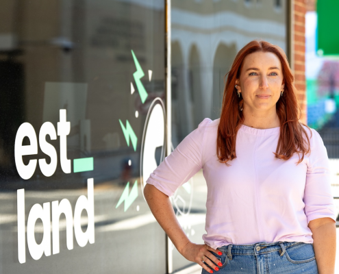
Stacked Logo Communicates Estland’s Story More Clearly.
The new logo communicates the meaning behind Estland’s name more clearly by stacking and separating its key elements, “est” and “land.”
The “Est” in our name stands for “Established.”
All businesses strive to establish themselves in their industry, community and beyond. Our marketing, branding and web services support business owners throughout that journey. We build and grow established companies.
“Land” represents the concept of “Legacy + Brand.”
We are passionate about helping businesses craft a compelling brand that embodies their values, resonates with a target audience and leaves a legacy for future generations.
As a bonus, the word land symbolizes power, self-sufficiency and leaving a lasting mark.
ESTablish + Legacy + BrAND = Estland.
By combining “Established” and “Land,” we capture what we aim to achieve for our clients. “Estland” reflects our commitment to helping businesses become more established and leave a lasting legacy.
The new logo design allows us to tell our story better and share the deeper meaning behind our business name.

The Logo’s Underscore Reinforces Estland’s Customer-Centric Values.
Another element in the new logo is an underscore.
Austin Raines, graphic designer at Estland, explains the significance behind the underscore as
The underscore represents our client’s moment. It’s a blank canvas for businesses to explore and expand upon their identity. It also conveys the sense of safety found working with Estland – we’re a haven for businesses to cultivate their brand as they make the most of their moment.
The idea of the underscore being able to freely change color based on its application speaks to the notion that Estland is flexible and fluid, never stagnant.
Occasionally, we will integrate our clients’ branding into the underscore to emphasize their importance to our brand. At Estland, we are all about our clients and THEIR moments.”
Austin Raines, Graphic Designer, Estland
We Expanded The Color Palette To Match Our Vibe.
After being bound by navy and yellow for so long, a bright and vibrant color palette displayed on crisp black and white canvases was another important aspect of the new identity. Like our new colors, our team is diverse and builds strength from the many talents of its individuals.
The palette’s black and white swatches also act as building blocks to incorporate our clients’ colors into our work through case studies and storytelling.

These colors feel just like us. They’re our vibe. And there’s a sense of excitement that comes with matching how you feel on the inside with how you show yourself to the world on the outside.
The graphic identity feels current, fresh and vibrant. And that is what we are right now.”
A Custom Website That Pushes Development Boundaries.
We were out there building dozens of brilliant, user-friendly websites for clients across the country, yet our own website didn’t scratch the surface of what our team did daily.
The new Estland site authentically tells our story, focuses on results and showcases our team’s capabilities.
It combines our messaging, values and visual identity. It shares real results from real clients and showcases recent work while reintroducing our team and articulating what we stand for. Oh, and it’s also mobile-friendly and ADA-compliant.

I was truly energized by the challenge of developing Estland’s new website. It was an opportunity to push the boundaries of our creativity, exceed our clients’ expectations, while staying true to our brand identity.”
Kyle Weston, Digital Director, Estland
Explore the pages for yourself to see how it puts the FUN in FUNctional.
New Branding Puts Our Best Foot Forward.
Our new brand reflects our core values of authenticity, excellence and social responsibility.
Playing with the new identity and testing its flexibility across applications has invigorated our team these past few months. It’s a work in progress because branding is never truly done, but let us know what you think of our soft launch.
We have a proven track record for creating incredible work for clients. But as it turns out, the most difficult client to work for is ourselves!
I am so thankful for the focus and collective talent of our team because when we put our heads together, we actually achieved it. That’s something to be proud of,”
Lindsey Kelly, Digital Hybrid, Estland
Partner With Estland For Effective Marketing You Love!
Estland is a full-service marketing agency that delivers real results. We’ve been creating effective marketing campaigns since 2006 and have the people, resources and knowledge to creatively communicate your brand to the right people at the right time.